
Estimated reading time: 4 minutes
Taking it further with a python excel chart.
We have created some video content here using Python with Excel that illustrates the different ways you can leverage Python to
- Data cleanse
- Find unwanted characters
- And see if the file is empty before import!
What this video is giving as output
Here we are looking to introduce charts in Excel, and how how to use Python to easily work with your data and export to an excel sheet.
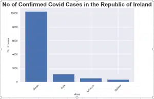
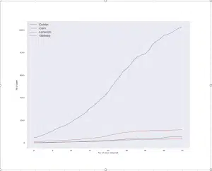
Below is the final output of our two charts, this is for illustrative purposes, and is taken from the Irish Government’s website as at 1st May 2020, importing the cell ranges associated with them.
How we went about it
Step 1 – Importing the data
import pandas as pd
import openpyxl


importfile = openpyxl.load_workbook("C://dataanalyticsireland/Python Code/youtube/codeused/files/Covid19CountyStatisticsHPSCIreland01052020.xlsx")

#Telling the program to go to each individual sheet
Dublin = importfile["Dublin"]
Cork = importfile["Cork"]
Limerick = importfile["Limerick"]
Galway = importfile["Galway"]

#Telling the program for each sheet , create a dataframe.
dfDublin = pd.DataFrame(Dublin.values)
dfCork = pd.DataFrame(Cork.values)
dfLimerick = pd.DataFrame(Limerick.values)
dfGalway = pd.DataFrame(Galway.values)
Step 2 – Splitting the different sheets out into different data frames
### Showing to break down here, further on I cocatenate the dataframes  ###

#This brings in all the values from the sheet into a variable so they can be read.
datadublin = Dublin.values
datacork = Cork.values
datalimerick = Limerick.values
datagalway = Galway.values
#This tells the program that the headers are on row 0.
columnsdublin = next(datadublin)[0:]
columnscork = next(datacork)[0:]
columnslimerick = next(datalimerick)[0:]
columnsgalway = next(datagalway)[0:]
# The imported file has the column headings on row 0, moving them to be the actual column headings instead of numerical values.
dfDublin = pd.DataFrame(datadublin, columns=columnsdublin)
dfCork = pd.DataFrame(datacork, columns=columnscork)
dfLimerick = pd.DataFrame(datalimerick, columns=columnslimerick)
dfGalway = pd.DataFrame(datagalway, columns=columnsgalway)
Step 3 – Exports all three data frames to a separate tab each to the below file
# This starts the process of where to save the output by creating a writer variable
writer = pd.ExcelWriter('C://dataanalyticsireland/Python Code/youtube/codeused/files/Covid19output01052020.xlsx')
# Save the dataframe "Dublin" to Dublin sheet etc...
dfDublin.to_excel(writer, 'Dublin')
dfCork.to_excel(writer, 'Cork')
dfLimerick.to_excel(writer, 'Limerick')
dfGalway.to_excel(writer, 'Galway')
# save the excel file
writer.save()
Step 4 – Merging all the data to allow the charts to be created easily
mergedPDList = [dfDublin,dfCork,dfLimerick,dfGalway]  # Creating a new merged list of the dataframes, easier when doing charts below
mergeddf = pd.concat(mergedPDList) # physical merging of the dataframes
Step 5 – Creating a bar chart
import matplotlib.pyplot as plt
import matplotlib.pyplot as pltline
import seaborn as sns
#from openpyxl.drawing.image import Image
#This makes the seaborn library over ride the matplotlib properites for styling
sns.set()

plt.figure(figsize =(9,6))
plt.bar(x = mergeddf['CountyName'],
       height = mergeddf['ConfirmedCovidCases']
       )
plt.xticks(rotation = 45)
plt.title("No of Confirmed Covid Cases in the Republic of Ireland", fontsize=25, fontweight='bold')
plt.xlabel('Area')
plt.ylabel('No of cases')
plt.width = 35
img = plt.savefig('C://dataanalyticsireland/Python Code/youtube/codeused/files/barchart.png',bbox_inches='tight')
plt.show()
Step 6 – Creating a line chart
x = dfDublin['ConfirmedCovidCases']
x1 = dfCork['ConfirmedCovidCases']
x2 = dfLimerick['ConfirmedCovidCases']
x3 = dfGalway['ConfirmedCovidCases']
#Sets the size of the output before it is created
pltline.figure(figsize=(15,15))
pltline.plot(x)
pltline.plot(x1)
pltline.plot(x2)
pltline.plot(x3)
pltline.legend(['Dublin', 'Cork','Limerick','Galway'], fontsize="x-large")
pltline.ylabel('No of cases')
pltline.xlabel('No of days elapsed')
img1 = plt.savefig('C://dataanalyticsireland/Python Code/youtube/codeused/files/linegraph.png')
pltline.show()
Step 7 – Exporting charts to the XLSX file
from openpyxl import load_workbook
#from openpyxl.drawing.image import Image
import openpyxl
#This step opens the existing file.
wsnew = load_workbook('C://dataanalyticsireland/Python Code/youtube/codeused/files/Covid19output01052020.xlsx')
#This step creates a new worksheet called Barchart
newsheet = wsnew.create_sheet("Bar Chart",4) #Creates a new sheet in fourth position
newsheet1 = wsnew.create_sheet("Line Graph",5) #Creates a new sheet in fifth position
#Adding the image to Newsheet which is called "Barchart" in the excel file
img = openpyxl.drawing.image.Image('C://dataanalyticsireland/Python Code/youtube/codeused/files/barchart.png')
img1 = openpyxl.drawing.image.Image('C://dataanalyticsireland/Python Code/youtube/codeused/files/linegraph.png')
img.anchor = 'B2' # Tells what cell to put the imahe in
img1.anchor = 'B2' # Tells what cell to put the imahe in
newsheet.add_image(img) # Adds the image
newsheet1.add_image(img1) #Adds the image
wsnew.save('C://dataanalyticsireland/Python Code/youtube/codeused/files/Covid19output01052020.xlsx')
wsnew.close()
In the below video on creating a python excel chart, we have approached this as follows:
- Created four separate data frames, they are the four regions that will feed into the creation of the graphs.
- Separate to this, we merged the four data frames into one, to use with the bar chart.
And to finish off
- We created matplotlib charts and
- We exported the file to Excel using openpyxl.
If you like what this video has explained, please click to see our YouTube channel for more informative videos.
Data Analytics Ireland
